Six UX Challenges Building Slack Apps And How We Fixed Them
 After several months of intense app development and user testing, we’ve learned a lot about six big user experience (UX) problems that most product teams will run into when building feature-rich apps using the Slack API. We're sharing a quick summary so you don’t have to figure things out the hard way, including updates about new Slack App Toolkit just announced at Slack's Spec developer conference.
To give you a little context, we learned these lessons while building Cloverpop for Slack, an app for keeping track of decisions in Slack. It integrates deeply as a Slack-native app and adds important missing decision-making features to Slack including decision polls, multi-channel announcements, approvals and tracking. We had to figure out the best way for people to create these polls and approvals, easily get input from other people, and manage all the Cloverpop decisions that get created.
We want to be the best app in the Slack App Directory, so we kept two ideas in mind while designing the app. First, our mantra was to “let Slack be Slack,” which meant we wanted to fit in with the flow of Slack interactions and not feel like a bolt-on app. Second, our goal was to truly delight people with an easy and fast user experience that quickly earned their trust.
Here’s what we’ve learned so far, and where we're going next.
1) Nobody likes (to use) /slash commands, except the few who do.
This was probably the biggest surprise from our user testing, given the (fading) hype around bots. Even though we only had a few easy-to-understand commands like /cp poll, approve and list, I still heard usability testers say dozens of times, “I really don’t like typing.” And they said this, without any irony, while using Slack, a group text chat app.
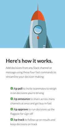
Interestingly, when reading the How It Works section of our landing page where the commands are listed out, those same people are very likely to say, “I like these commands, they are very clear, I can see how they would be helpful.” Of course, that is before they have to type them.
Finally, a few people (maybe 5%?) do really like /slash commands, and active users also tend to use the commands more as shortcuts. The Slack user base includes quite a few technical teams, so it’s not that surprising that there are command-line people out there. And some of them want even more command-line power.
Our Hacks: We still market our quick /slash commands, but we don’t confuse that marketing value with how people use the app. We shortened our /slash command from /cloverpop to /cp and kept our command words as short as possible. For the command-line people, we added some simple compound commands like /cp poll What should we do about people hating on /slash commands?, and we continue to improve the command-line experience.
The Future: There is really one major fix to the /slash command typing problem, especially for new users: Make it easy to use your app without every typing a command at all. In other words...
2) Everybody really likes buttons.
Who doesn’t like point-n-click? Our very first beta tester literally said, “I really like buttons, everyone likes buttons, you should use more buttons.” The problem is that Slack imposes all sorts of constraints on buttons in the Slack interface like only allowing five buttons to be visible in a block, restricting access to Slack in-app menus (for now) and severely constraining button styles for consistency.
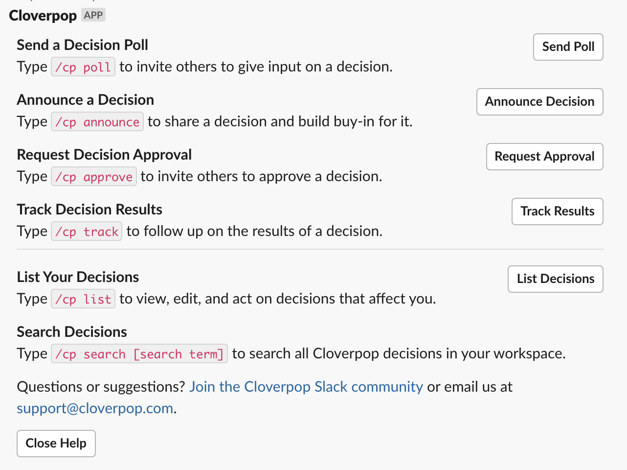
As an early quick fix, we designed a help message with five buttons for our five most commonly used commands, and then used the app_home_open API to display it to new users. People loved this...but then when they closed that help message, or if that help message scrolled off the top of the stream, they would call out, “Wait, where did the app go?” People literally thought of the help message as the app, because that’s where the buttons where.
This is the biggest usability problem in Slack. We call it the “persistent buttons” problem, i.e. people want buttons that invoke top app actions and lists/reports to always be visible. That’s tough to do in Slack since the message stream just keeps flowing, pulling any buttons and messages along with it.
Our Hacks: People are very happy with our beloved help message with five simple buttons for our top commands. For all the messages we send to other people in the workspace, such as Cloverpop decision polls and approval requests, we have very clear buttons for them to click like “Vote” or “Approve.” For more active users, we created a consistent button group that we show together with any decision messages so that there is always a button available for the most likely next step people want to take.
The Future: This week Slack unveiled a new interaction surface that solves the "persistent buttons" problem and will revolutionize Slack apps from now on. It's called "App Home" as in the home page for your Slack app. It's is a default, persistent view that breaks free of chaotic message streams and provides a consistent experience for users to get to know your app, take action and find information. It is a natural place for buttons. It solves the most painful usability problems I've seen. It is the future of apps in Slack. And we're all in to unlock the awesomeness of App Home in Cloverpop!
Soon, landing on our App Home will show you all the decisions you're involved with and all the decisions happening across your team, with fast access to every action you can take to keep track of decisions in Slack. Stay tuned!
3) People want to try collaborating by themselves first.
It’s tricky to try collaboration apps because you have to use them together with other people to 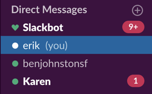 really understand how they work. This is a problem even for easy-to-use and helpful apps like ours, especially the first time people try it. Most people are reluctant to just start firing off messages to people from a new app. So instead they send test messages to themselves -- or maybe to a trusted friend, a #random channel or even a private channel -- to understand how the app works.
Our Hacks: We made sure that the app works the same no matter where people wanted to send their Cloverpop decisions. They can send a decision as a direct message to themselves or a colleague, to several people in a group DM, to a private channel or any combination of the above. That way people can get a feel for how the app works on their own, and introduce it to larger and larger groups as they go. Finally, since some people aren’t able to add apps to their own workspace, we wrote a simple blog post explaining how to join our Cloverpop Community on Slack and try the app there.
The Future: The great thing about Cloverpop is that most people are introduced to the app when someone else sends them a decision announcement or decision poll, so they already have a basic understanding of our app before they send an announcement or poll themselves. The new Slack API features will improve this "non-installing user" experience including friendlier app authorization with the new granular permissions, (hopefully) smart contextual linking back to Slack from the permissions screen, and deep-linking from messages direct to the App Home tab.
4) Chat messages look the same for everyone.
This doesn’t sound like a problem...of course messages look the same for everyone, that’s how Slack works! For instance, when you announce a decision to your #leadership and #general channels, that decision announcement in the #leadership and #general channels looks the same for everyone, including you, the person who sent it. Makes sense.
However, this causes problems when you have two different types of users, 1) the person reading the decision announcement and 2) the person who sent the decision announcement and might want to do something more with it. What if you have an “oh sh!t” moment and want to make a quick edit, but you don’t want to have to go to both channels and change the message twice? Since you created the decision announcement, you want a little “Do More Stuff” button that only you can see. But Slack doesn’t allow this...the message has to look the same for everyone, including the button.
Our Hacks: We mostly solve this problem with ephemeral messages. When someone takes an action like sending a poll, approval or announcement, we immediately send them an ephemeral message -- i.e. a special temporary Slack message only they can see -- which declares “Success!” and includes a “Show Decision” button.
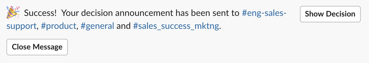
When they click on that “Show Decision” button, we replace that ephemeral message with a new one that includes everything they need to edit or manage that decision.
We use this same view when displaying search results so that whenever someone uses Cloverpop to /cp list out recent decisions or /cp search for older decisions we include everything they need to edit or manage their decisions right there in the results.
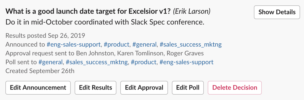
The Future: The Slack API's new Modal features are a huge leap forward in solving this problem, because now we can have a single button, let's say "Show Decision", that launches different modals for different people depending on what they may want to do. If a decision owner clicks "Show Decision" on a recent decision poll, the modal that opens up will let them edit the poll, take another action like requesting approval or announcing the final decision, or drill down into more details of the decision.
In addition, App Home will also help here by giving every user a simple, central, personalized view into the decisions they are making and that are being made across the workspace, putting less pressure on jamming more messages and more interactivity into more channels.
5) The Slack API multi-select menu is (almost) a godsend.
Forms in Slack apps still have very limited interactivity, but Slack is adding more great stuff all the time. For instance, the Slack API’s new multi-select menus almost solve a ubiquitous pain. And combined with the new Block Kit elements for modals, they solve it all the way.
Multi-select problems were our most common usability snafu. While watching dozens of usability test videos I saw people fumble dozens of times, i.e. everyone fumbled. If people wanted to send a decision poll or announcement to several people and channels at once, they’d have to painstakingly pick them individually, one after another. They’d often pick the same one twice. And sometimes they’d have a hard time figuring out who was on the list and how to remove them.
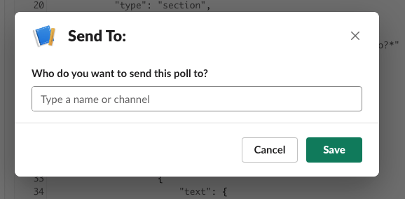
The new multi-select menus work great, but they still have a painful problem. People often don’t realize that they can begin typing a name inside a dropdown menu to find it. This is a problem because the pre-loaded list of people and channels only includes the first 24 in alpha order, so people get confused about where Xavier and Zarathustra went. We fixed that in our dropdown menus by including helper text in the entry field to prompt them to “Type names.” However, the out-of-the-box multi-select menus don’t allow this helper text -- the button text, modal title text and entry field helper text are all the same.
Our Hack: Honestly, we didn't have a good hack for the multi-select problem, so thankfully Slack stepped up...
The Future: Rather than using the out-of-the box multi-select menu, we’re combining the multi-select component with the Slack API’s new dynamic modals to create a perfect “Send To:” modal. We get all the benefits of the multi-select menu and can still customize the helper text to prompt people to “Type names.” It’s a simple fix that works like a charm, and it will be live soon!
6) People hate walls of text (from chatbots).
First, let’s be clear on two things: 1) most people really like Slack and 2) the Slack experience is mostly comprised of never-ending walls of text. However, it turns out that a wall of text messages written by people chattering back-and-forth, where you can jump in and be the star of the show any time you want, is very different from a wall of text generated by a chatbot app doing it’s best to keep you informed. People like chattering people. People don’t like chattering chatbots.
When user testing surfaced complaints like, “I hate that wall of text,” we knew we had a problem. But it’s a tricky problem because people also don’t like silent chatbots. They want to know what’s going on...they just don’t want to drown in messages about what’s going on.
Our Hack: This was an exercise in user-tested design iteration. We winnowed down the number of messages we sent to people and made those we did send as short as possible. We made it easy to dismiss messages and easy to find decisions later so people didn’t feel the need to keep a bunch of clutter around. We used emojis here and there to lighten the mood 😃. In general, we did what we could to stay out of the way and let Slack be Slack.
The Future: Continuing the theme, the new App Home and dynamic Modals features will greatly eliminate this problem. Rather than cluttering up the message stream, as much as possible we will use Modals for rich mid-stream interactions and send people to App Home for decision-specific actions. We'll share our experiences designing and developing that new experience soon!
What Did We Miss?
We’re still learning a lot every day about building the best Slack app (which you can try for yourself, of course :). We’ll keep sharing what we learn as we go. If you think I’ve missed anything, let me know on Twitter, @erikdlarson!