How-To Guide: Usability Testing For A 💯 Slack App User Experience (UX)
We do continuous usability testing because we want our app, Cloverpop, to have the best native app user experience in the Slack App Directory.
The Slack API has fantastic developer resources and clear UI guidelines. However, when I went looking for advice, there was almost nothing out there about the nitty-gritty of testing usability and overall user experience (UX) for native Slack apps.
So, for all the other developers out there banging away at Slack apps, here’s how we continuously test and improve our Slack app user experience, and what we’ve learned so far.
Warning: User Experience Is Extremely Important To Us
Cloverpop is the way to keep track of decisions in Slack. We know from years of research that it’s super-hard for people to change behavior around decision-making. So we use usability testing extensively to help us build a fast, enjoyable, perfectly crafted app, and overcome the many UX challenges of building Slack apps.
If you have less intense UX requirements than ours, just pick and choose from this summary to suit your needs. Every bit helps.
Let’s get started!
1) Pick The Right Approach -- When To Prototype vs. Just Build It In Slack
Prototypes are a powerful source of customer insight. However, they are not always the right tool. I find that prototypes make the most sense when: 1) your primary UX challenge is understanding what problem your app is solving or 2) it’s hard/expensive to build and test a real solution to that problem.
If you are two people in a garage with an idea or a group sitting around a conference table spitballing ideas, then assumption #1 applies, and you should prototype first. This assumption doesn’t apply to Cloverpop -- we’ve already done years of research to understand the problems people face while making decisions at work.
Instead, since we are trying to build a great user experience, we focus on assumption #2: Will it be faster and easier to test a prototype? Not always, in fact, in our experience, usually not! With Slack apps, it’s often almost as fast to build a real feature in Slack as it is to prototype one.
More importantly, it is far easier and more effective to test a real collaboration feature versus a prototype simulation. Collaborative apps are tough to “fake” with a prototype and still see what problems people are likely to run into. Actually sending a decision poll to your co-workers for their input is an ALMOST COMPLETELY DIFFERENT EXPERIENCE than clicking through an interactive prototype that asks you to imagine you work at Acme Co and your name is Jane Smith.
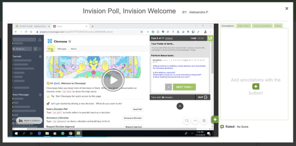
We use InVision prototypes to test one or two core workflows in major new redesigns. Otherwise, we test and iterate on the real thing. For instance, when we built out our new App Home experience, we created a clickable App Home prototype for testing. When we completely redesigned our notification messages, we created a message and modal prototype. In total, out of our last 15 major usability tests, only three used a prototype. The other 80 percent used the real live Cloverpop Slack app.
2) Pick The Right Tool -- Videos Are Critical For Slack App UX Testing
To be productive, you need the right tool. When it comes to fast and effective Slack app usability testing, nothing beats a 30-minute video of someone talking out loud while trying to use your app.
I use TryMyUI.com for this. It’s affordable (~$35/test) and fast (in our experience results come back in 8 hours or less). We’ve also found that their pool of testers is a good fit for a business app like ours. We are focused on existing Slack users, so we always ask a qualifying question to make sure they regularly use Slack at work.
The videos can be painful to watch, but they are critical for three reasons. At the surface, I get valuable feedback about what people expect, where they click, and where they get confused. Going deeper, I can also judge their emotions and interest -- not just whether they figured out what to do, but also how they felt about the experience as they went. Finally, I share video snippets with my team to show them what I see, both good and bad, so we are all more informed and motivated to solve any UX problems the tests uncover.
3) Break Up Your Slack App UX Journey Into Stages
We couldn’t test and improve everything all at once, so to guide our Slack app usability testing, I broke down the user journey into these five stages:
- Landing Page Experience: This is the page on our website, or the page on the Slack app directory, where people first learn about the app. We focused on our landing page first, which also served as a mock-up of the Slack App Directory page before we went live.
NOTE: You can test, iterate, and dial in your app before you go live on the directory. And even once your app is approved, you can choose to hide it from being publicly listed on the Slack App Directory until you’re ready. Your app directory page will be live, just not searchable from within the directory. - Install Experience: The install experience for Slack apps is pretty seamless most of the time, but from watching dozens of user tests, I also know that the experience differs quite a bit from workspace to workspace. We wanted to fully understand this critical step, especially the experience of people who start using the app after it has already been added to their workspace by another user.
- First-Time App Experience: This is about what people see and experience in the first 20 seconds after installing the app. Do they understand what the app does? Do they feel comfortable and in control?
- Initial Trial Use Experience: This is about the first few interactions people have with the app. What do they want to try first? How do they want to explore the app, given that it is a collaborative experience? Are they successful and confident after their first experience?
- Active Use Experience: This is about the experience people have once they are actively using the app. It is hard to test the active user experience before you have a large active user base, but simulating it with well-crafted usability tests can still teach you a lot.
I did specific UX tests focused on each stage and also how the stages flow together. Early on, we focused most of our efforts on the first three stages with intensive prototype and beta app iterations and then moved on to the last two stages as we built out the full Slack app.
4) Write Clear User Tasks And Ask Open Questions
First, make sure that you qualify your testers properly, not only so you get the right people, but also because it forces you to think more about the personas who will be testing your app. We only test with people who work in companies that use Slack daily, regularly participate in decisions at work, and want to improve how decisions happen. Beyond that, our app is broadly applicable, so we don’t limit our testing to specific departments or in other ways.
As far as writing the tasks themselves, I try to keep the tasks bite-sized, with frame-of-mind explanations for context and open-ended questions. I also add hints to more complex tasks that build on each other, so the tester doesn’t get stuck. In general, our usability tests are 20-30 minutes long, with 7 to 10 tasks. Here are some examples from our successful usability tests that you can borrow and tweak:
- Test Scenario: You regularly participate in decisions at work and want to find a way to improve how your team makes decisions. You recently heard about a new app for Slack that helps teams keep track of decisions at work. It's called Cloverpop. You clicked on a link that brought you to this landing page for the app.
- Landing Page: Review the page as if you are considering trying the app, describing your thoughts out loud. Then answer these questions, including the reasoning behind your answers: What makes you more interested in trying it? Is there anything that might hold you back?
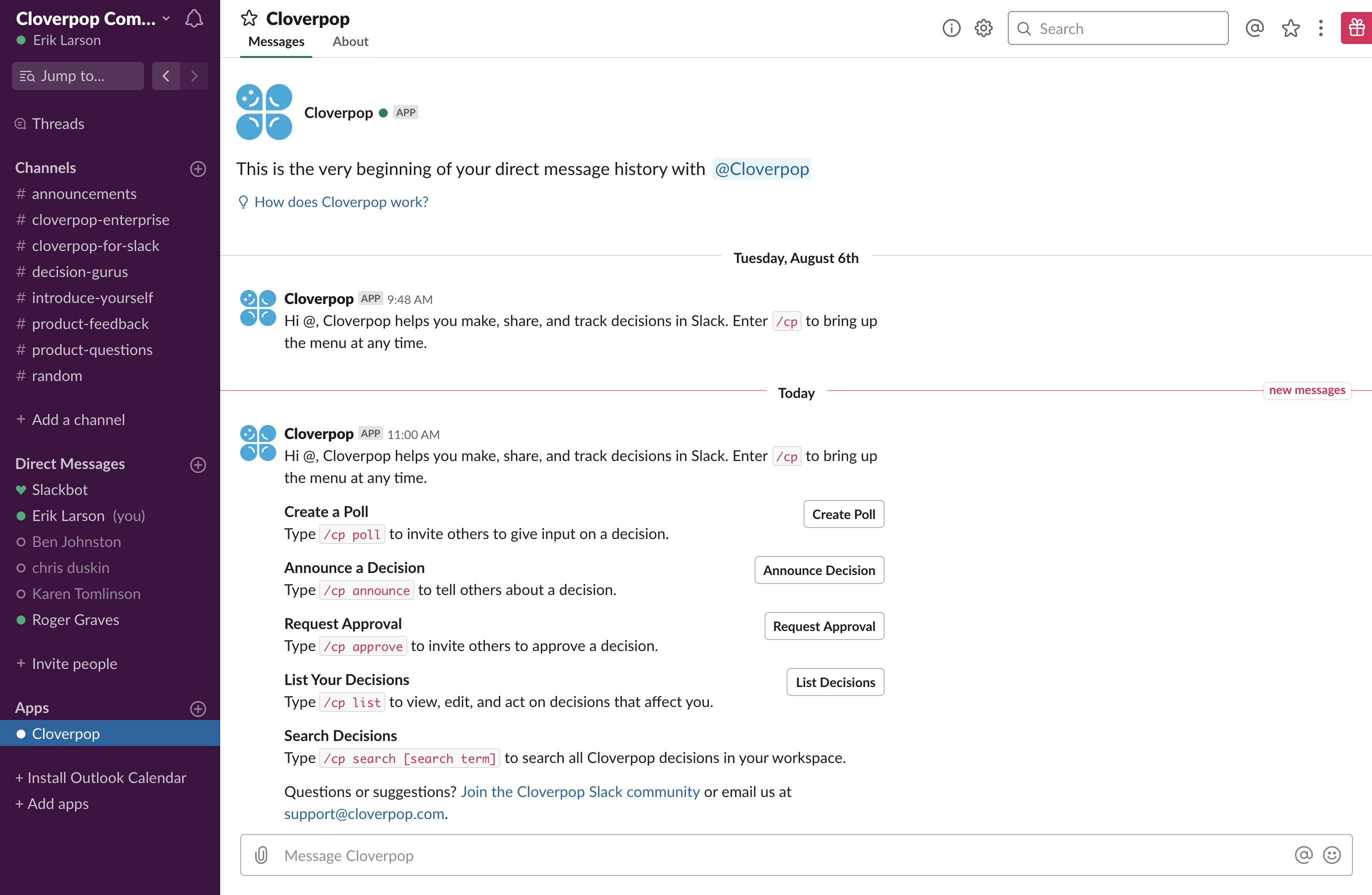
- First-Time App Experience: Without clicking on anything, review the information you see in the Cloverpop app channel as if you are considering which feature to try first. What are you most interested in trying? Is there anything that might hold you back? Please proceed to the next task.
- Live App Open-Ended Exploration: Now go ahead and try the new feature that interests you most. Please describe what you think will happen before clicking on any buttons, and share your thoughts out loud as you go. If you can't figure out this task after a couple of minutes, please see the hint at the end of this task.
HINT - Type "/cp help" to pull up the help menu, then click the button for the new feature that interests you most. Follow the instructions you see. - Live App Task: Now imagine you have come to a decision based on the results of the decision poll and conversations with a few of the people involved. Find the poll you just created and announce a decision from it. Send the announcement to yourself and rate your level of support for the decision. Please describe your impressions as you go. Once you have announced the decision and rated your level of support, proceed to the next task. ONLY read the hint below If you cannot figure out how to complete this task on your own.
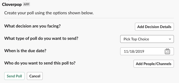
HINT - Find your decision poll, then click the Announce Decision button. You can use the "/cp search" command to find the decision. You will see a form to write up the decision announcement. On that form, you will have to Add Decision Details and choose which channel/person you want to announce it to before you can Send the announcement. - Prototype Introduction: Now imagine you decide to add Cloverpop to your Slack workspace and give it a try. We are going to show you a prototype of the welcome screen you would see after you first add Cloverpop to Slack. During the next few tasks, pretend that your name is Erik. Please click on the link below and proceed to the next task.
- Clickable Prototype Task: Now, we are going to have you try a prototype of the Announce feature. Please click on the Announce Decision button and answer the following questions about the screen you see in your own words: What would happen if you clicked on the "Add Reasons/Expected Results" button? What is the "Who contributed to making this decision?" question used for?
After you answer those questions, click on the Subject question. We've just pre-filled the decision announcement with example decision information. Review what you see and answer the questions below. Is anything different than what you expected? What is your impression of this screen? - Final Task: Great, you're done with that section of the usability test! Finally, we'd like you to explore the app a little more in the time remaining. Type " /cp help " and try the other features in the order that interests you most until you try them all or time runs out, describing your impressions as you go. If you try all the features before time runs out, please spend a minute or two sharing your impressions of Cloverpop overall.
- Tester Thank You: Thank you so much for your thorough test and thoughtful perspective. We're already making improvements based on your feedback and test experience. Feel free to use the app as much as you want. Thanks again!
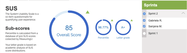
💡Pro tip: I use a standard System Usability Scale as an exit survey to benchmark our Slack app user experience and track improvements from sprint to sprint. Comparing our app experience to the SUS benchmark, as described by Jeff Sauro at MeasuringU, gives us an objective view of our app usabilty compared to software in general. Super-cool. Since ease of use is Slack’s hallmark, we set an A+ goal for our usability sprints. An A+ score is also known as the “best imaginable” usability score, and we work to hit it every time:
5) Use An Iterative Test Sprint Process That Assumes Failure
When you do usability testing, it’s essential to keep in mind that you are testing two things. First, you are testing the test protocol itself, i.e., the type of people doing the tests and the actual tasks that you expect those people to perform. Only after you get that right can you get to the nitty-gritty of testing your Slack app UX.
Because of this, I typically plan on 3 sprints of 2 testers each and then add more sprints if needed. This iterative approach leaves room to make adjustments between sprints and gets to insights faster. On average, we do two to three sprints a week. The basic plan for our usability tests looks something like this:
Sprint 1 - The First Pancake(s): If you’ve ever made pancakes, you’ve probably had the experience of messing up the first one...maybe the grill is too cold, or there wasn’t enough oil, or you tried to flip it too early. Similarly, our first usability test sprints almost always end up being about the test protocol itself, not about our app UX. Were the testers the right target users? Did they understand how we described the tasks? Did they run into any unexpected problems while adding or using the app that we didn’t account for?
Sometimes, I have more than one first pancake. For example, when testing our app install experience, it took me a few tries to write clear instructions. We were all surprised by how few people had experience adding apps to Slack or even using Slack apps. Many people can’t add apps to their company Slack workspaces. And the app install experience itself can be confusing if people are members of multiple workspaces.
So, here’s what that “first pancake” task looked like (multiple total failures), and where we finally ended up (works every time):
| First Pancake “Add to Slack” Task | Final “Add to Slack” Task |
|
Click the "Add to Slack" button to add Cloverpop to your Slack workspace. When you see a web page that says “Success! Cloverpop is waiting for you in Slack” follow the SUCCESSFUL section below. If you are not able to successfully add Cloverpop to Slack, follow the UNSUCCESSFUL section. IF SUCCESSFUL: Open your Slack desktop app and go to the new Cloverpop channel. It is near the bottom of your list of Slack channels on the left. Please proceed to the next task. IF UNSUCCESSFUL: Go to this URL https://www.cloverpop.com/hubfs/SlackboneTests/CloverpopSlackWelcome.png to see a screenshot of Cloverpop installed in Slack. Please proceed to the next task. |
>> IF YOU CAN ADD APPS TO YOUR SLACK WORKSPACE: Click the "Add to Slack" button to add Cloverpop to your Slack workspace. After you see a web page that says “Success! Cloverpop is waiting for you in Slack." open your Slack desktop app and go to the new Cloverpop app. It is near the bottom of your list of Slack channels on the left of the Slack interface. Then proceed to the next task. >> IF YOU _CANNOT_ ADD APPS TO YOUR SLACK WORKSPACE: Please follow these steps:
NOTE: Sometimes Slack gets confused if you have many Slack workspaces open. If at any point during the test you end up on a Slack administration screen with bold text that says you are not authorized to use Cloverpop, please go to the top-right corner of that screen and switch to the Cloverpop Community workspace. You will then be able to proceed. |
Sprint 2 - The Meat: After our user targets and tasks are dialed in, the fun begins. I find that usability problems are usually pretty obvious even after just two testers run through the app, especially early on before we’ve polished the journey we are testing. The insights fall into three buckets:
- “Send Is The Best Spell Checker” Insights: There’s something weird that happens when looking at your app UI while watching someone else use it -- kinda like sending an email, suddenly you see all sorts of problems! These are usually small things, but they all add up. For example, we used to ask, “How do you want participants to select choices?” when people were setting up decision polls. When I saw it on video...ugh! Now we ask, “What type of poll do you want to send?” Much tighter.
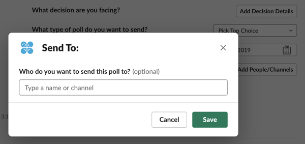
- “Oh, Duh!” Insights: Inevitably, people will run into UI problems, and the lightbulb will go off in your head. For instance, we use the Slack multi-select control to allow people to select which people and channels to send a decision announcement. Unfortunately, people often don’t realize that they can begin typing a name inside a dropdown menu to find it. This confusion happens because the pre-loaded list of people and channels only includes the first 24 in alpha order, so people get confused about where Xavier and Zarathustra went. So we fixed that in our dropdown menus by adding helper text to the entry field prompting them to “Type a name or channel.”
- “Oh, Sh!t” Insights: These are more significant problems that you probably won’t be able to fix in the course of a few UX sprints because they require architecture-level changes to your app. We found three such core Slack app UX problems in our very first usability tests: people like buttons, very few people like /slash commands, and people hate walls of text (from chatbots). As a result, we regularly got B’s and C’s on our SUS tests. We’ve been working on fixing those problems for months. It wasn’t until the recent announcement of the Slack App Toolkit that the Slack API finally gave us the right tools for the job, and we got A+'s on our prototype usability tests. The real thing is coming soon!
Sprint 3 - The Validation: I almost always do one more sprint after we think we know the core problems surfaced by the test. It helps validate the main issues when other people hit them (or not). Also, if the fixes are simple and fast to make, we can push them live right before the last sprint and validate that they work. Occasionally, we’ll do a 4th usability sprint for more complex user journeys. However, we rarely do more than four sprints (i.e., eight user tests) focused on any particular user journey. In my experience, there are diminishing returns after hearing from 5 to 7 people on any specific area of the app.
What Did We Miss?
Even after over 50 usability sprints, we’re still learning a lot every day about building a “best imaginable” Slack app user experience. We’ll keep sharing what we learn as we go. If you think I’ve missed anything or have any questions, let me know on Twitter, @erikdlarson.